Superior acoustics
Music centre and conservatory
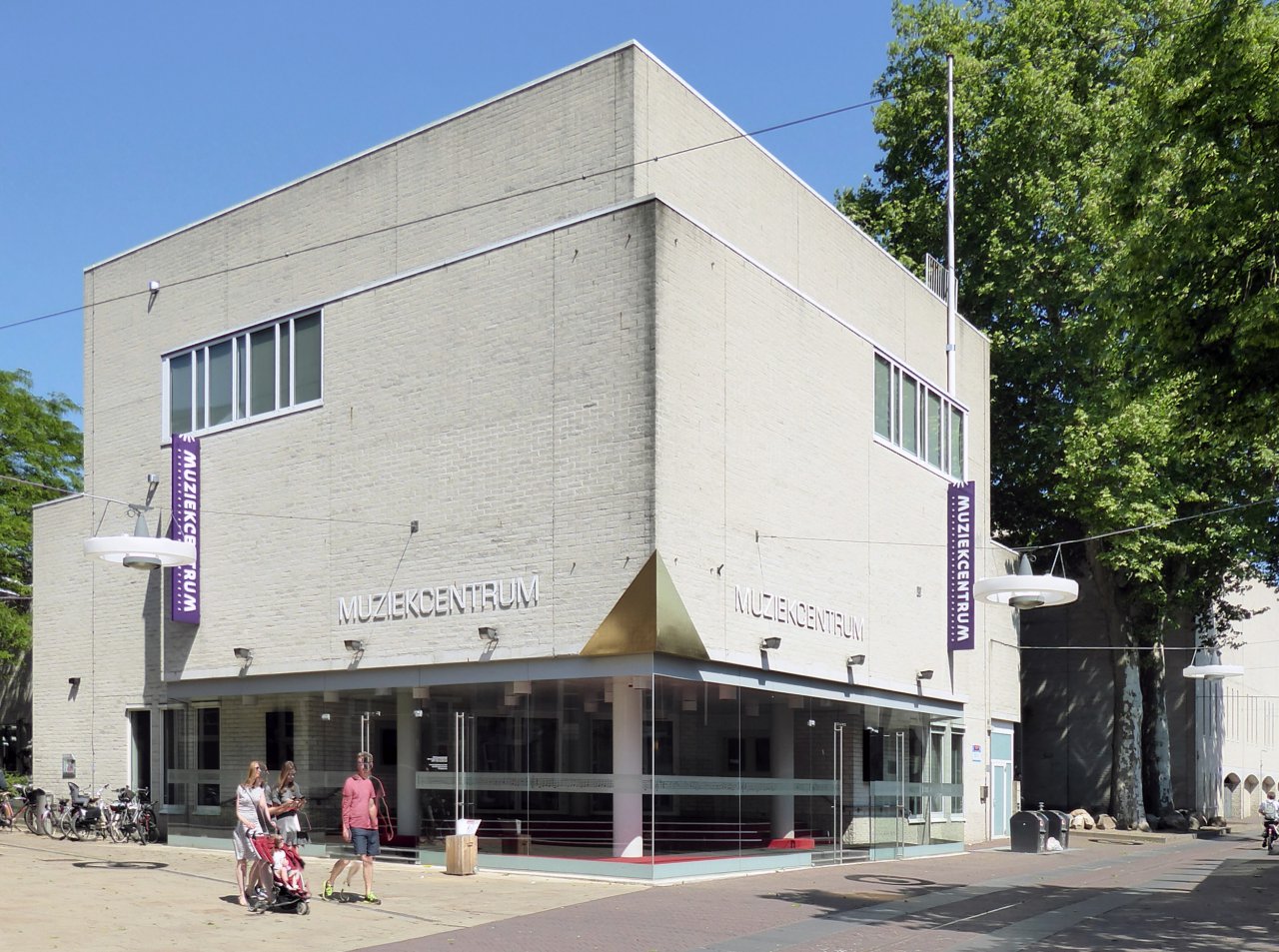
On 9 September 1988, Queen Beatrix officially opened the Music Centre in Enschede, consisting of a large and small concert hall, in a complex combined with the conservatory. It marked the start of putting Enschede on the map as the ultimate music city of the eastern Netherlands.
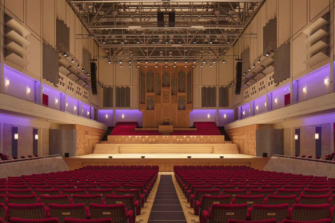
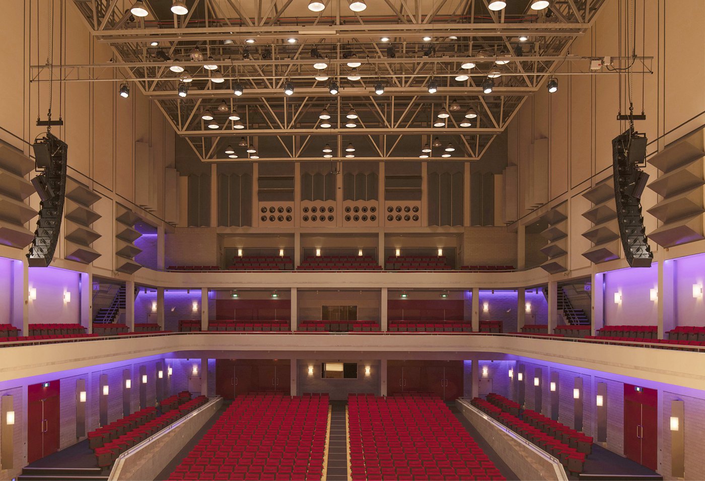
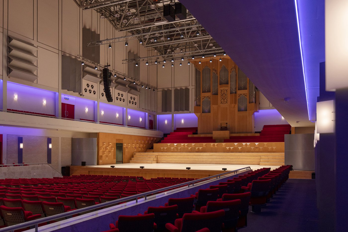
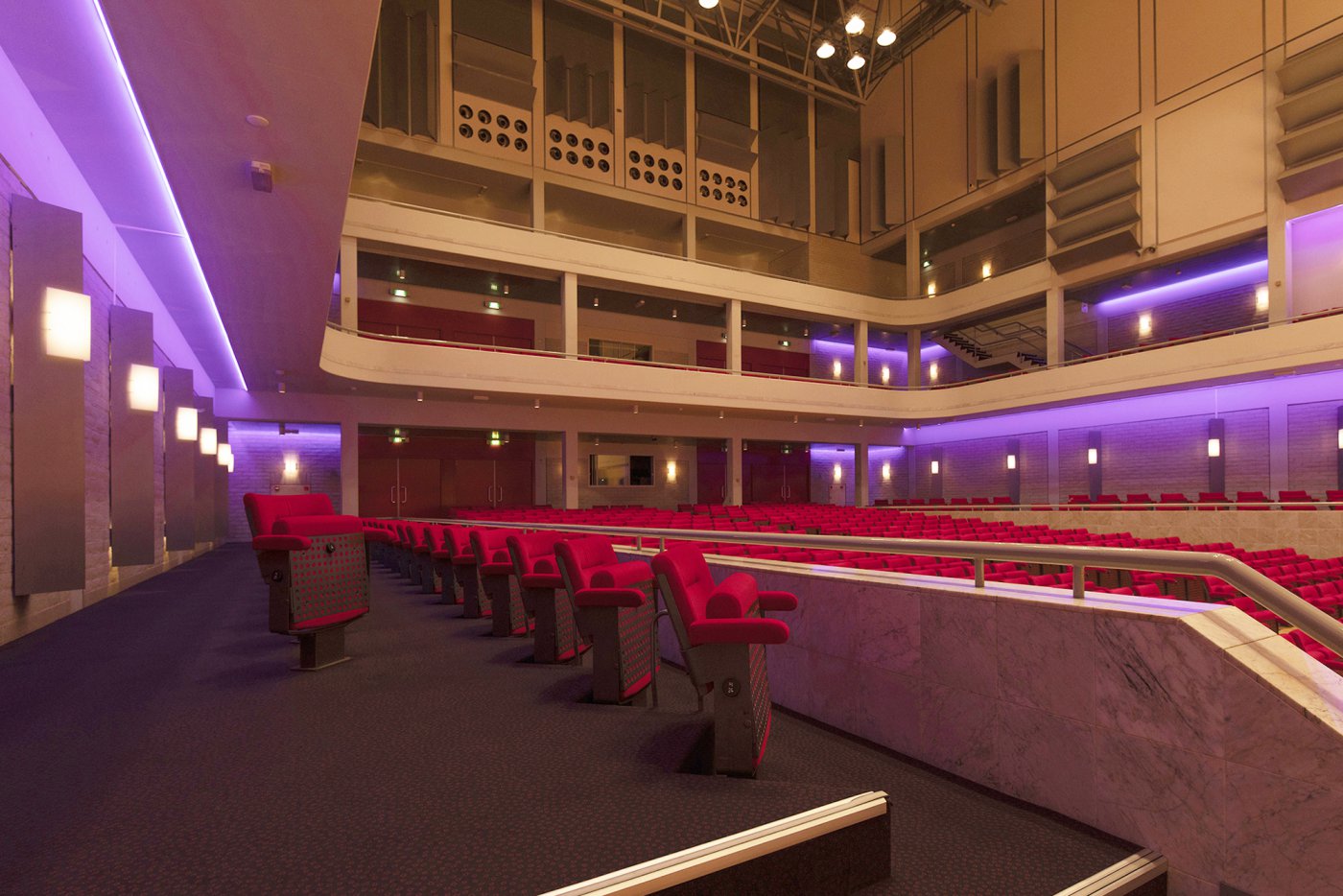
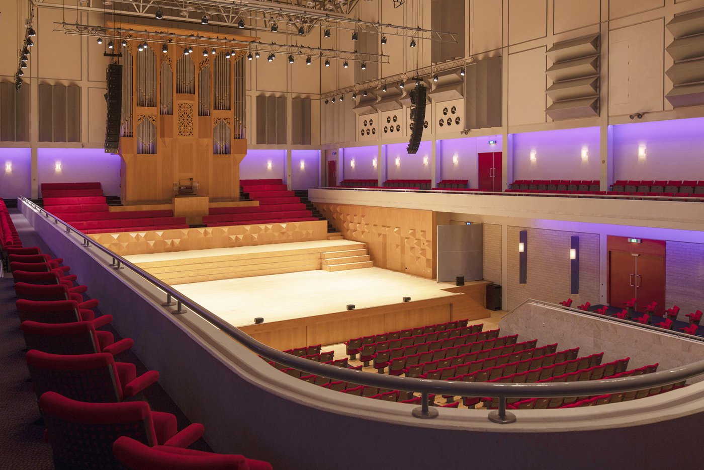
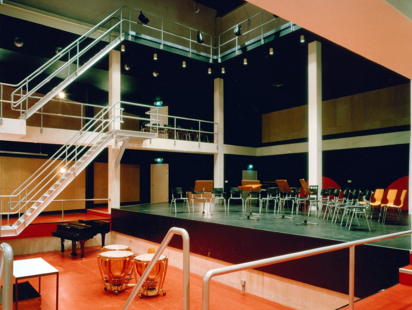
The multipurpose large hall is suitable for both symphonic as well as pop music and has a seating capacity of 1,230, but can be transformed in an instant into a hall with a flat floor which then offers 1,800 standing places. The small hall has around 200 seats.
Mayor Wierenga as key promoter
With the demise of the textile industry in the second half of the 20th century, Enschede as a city had been greatly damaged and had become a poor municipality. For its allure and to make the business climate attractive and thereby increase the city's future prospects, Mayor Wierenga felt it was of great importance that the cultural sector be given a boost with the arrival of a concert hall.
To get the project funded, he siphoned off the maximum possible amount from the so-called terugploeg scheme, a state subsidy pot for unemployed construction workers. But he also managed to persuade banks, bakers, notaries, estate agents, machine builders and many others to make donations that allowed the building to come into being.
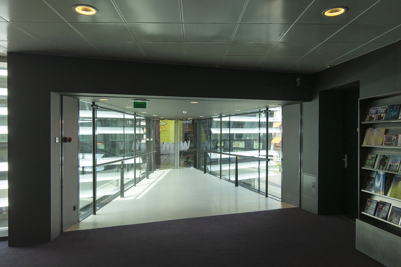
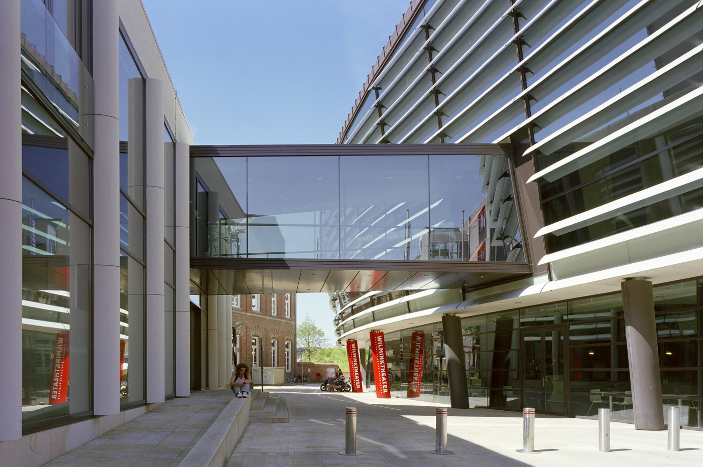
And indeed, the arrival of the Music Centre has strongly influenced the further development of Enschede's cultural life. Together with the Wilminktheatre, which opened in 2008, the Music Centre now forms the cultural centre of Enschede. Moreover, it fulfils an Euregional function for music lovers from Twente, East Gelderland and the German border region up to Münster.
'Shoebox' because of desired acoustics
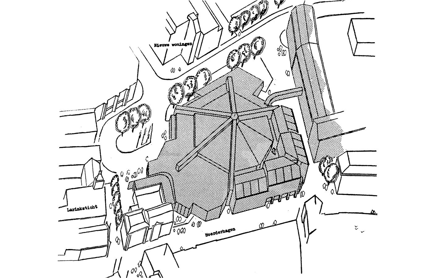
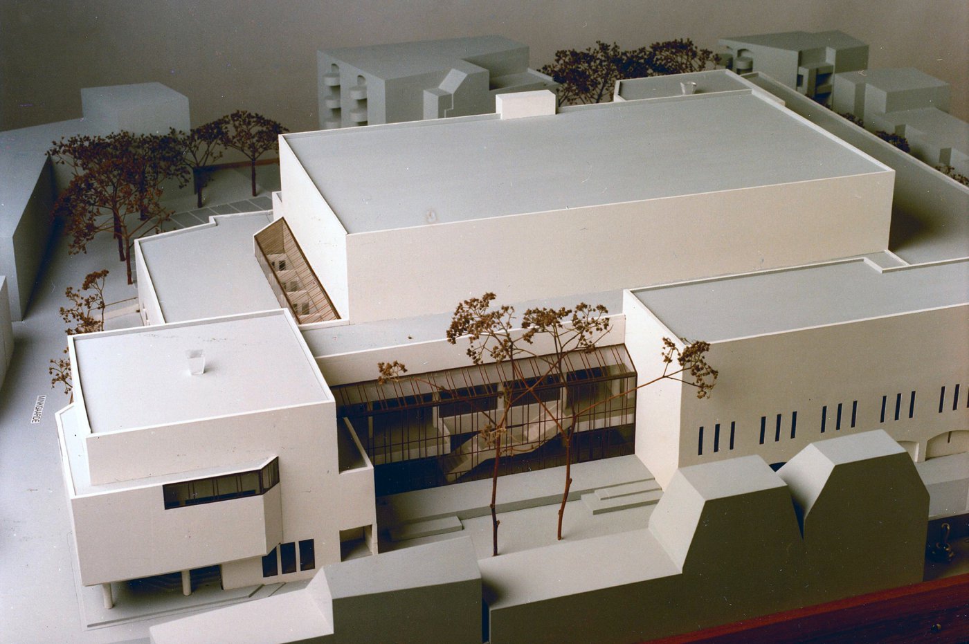
Originally, architect Boy Wendrich had designed the building in the shape of a tent, inspired by the Philharmonie in Berlin, with the orchestra positioned in the middle of the hall and spectators all around. On the advice of acoustic consultant Peutz however, the main hall was given the shape of a shoe-box, based on other models like the Gewandhaus in Leipzig and the Concertgebouw in Amsterdam.
This was much cheaper to build as it would require fewer provisions for high-quality acoustics, something that was always the starting point in the design. It did, however, become a very tall building, as good acoustics for about 1,000 concertgoers would require a height of about 18m and a width of about 21m.
The chosen design yielded the desired result! Musicians praise the outstanding acoustics, which they say are comparable to those of the Concertgebouw in Amsterdam.
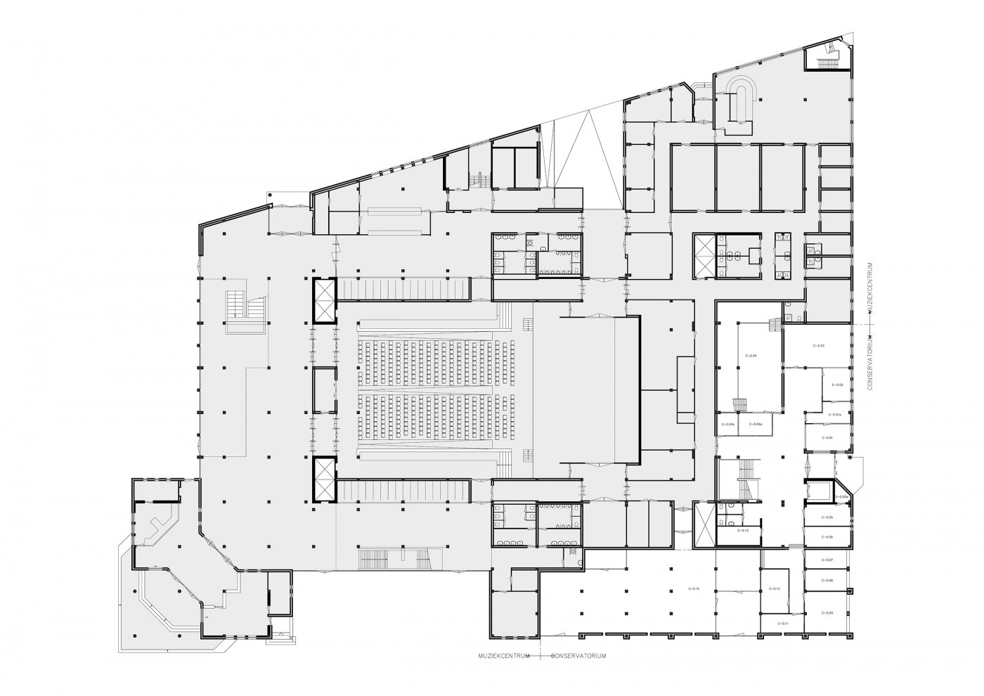
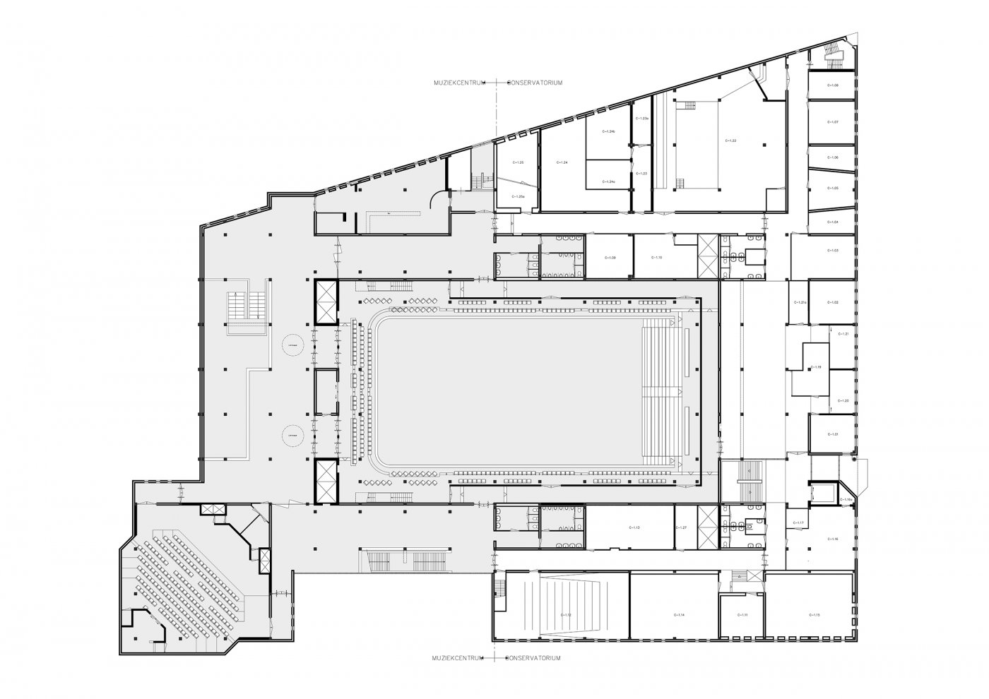
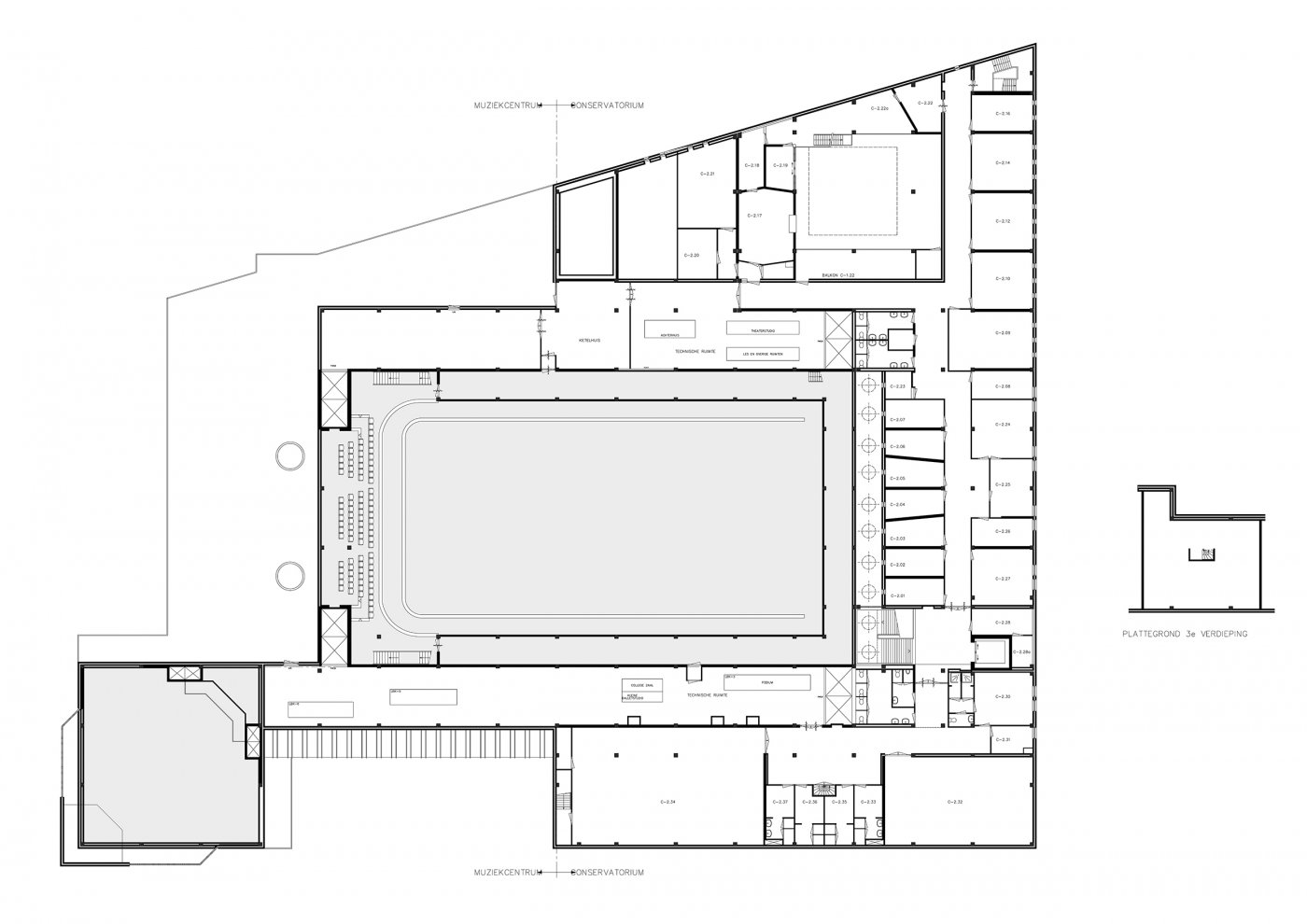
Combination with conservatory
To make the design financially viable, the idea was that housing should surround the new construction like a shell. However, this turned out not to be enough to comply with the terugploeg scheme. Eventually 'The Hague' suggested a solution: "Drop the housing construction and combine the concert hall with the Twents Conservatory". A brilliant idea, as the conservatory was in urgent need of new accommodation.
The combination of concert hall and conservatory could offer students many perspectives: not only could they use acoustically excellent rooms, but also be in direct contact with concert practice.
No mutual sound transmission
The large hall is free-standing in the Music Centre, separated by an expansion joint. It lies cut loose within the complex, as it were, so no contact sounds from the surrounding rooms can be heard in the hall and vice versa.
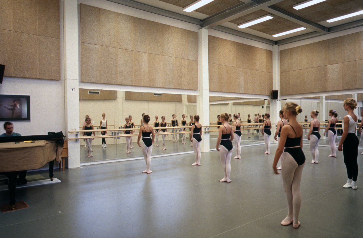
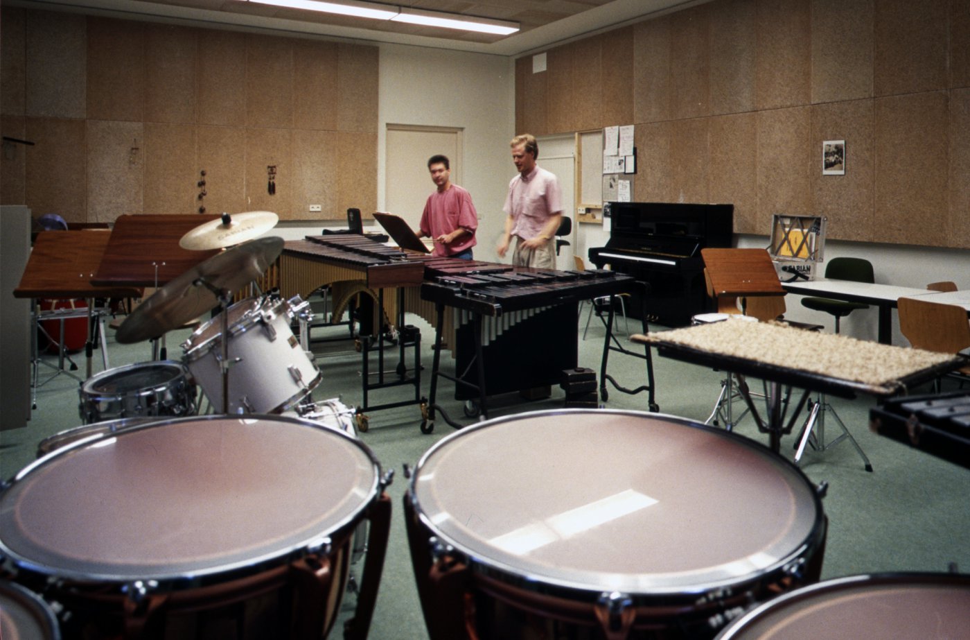
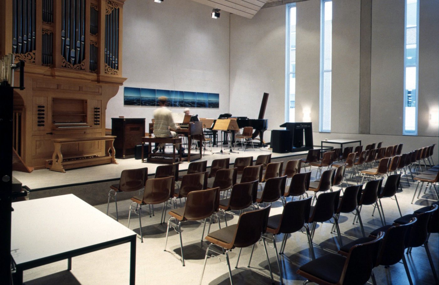
In the conservatory, practice rooms and studios have received their own specific insulation: floating floors on rubber layers or double floors on intermediate layers formed by rubber blocks. Depending on the penetrability of the sound, a box-in-box construction was sometimes used, e.g. in the percussion studio. To prevent annoying echoes, the partitions in some music rooms have been placed at an angle, allowing the sound to better disperse.
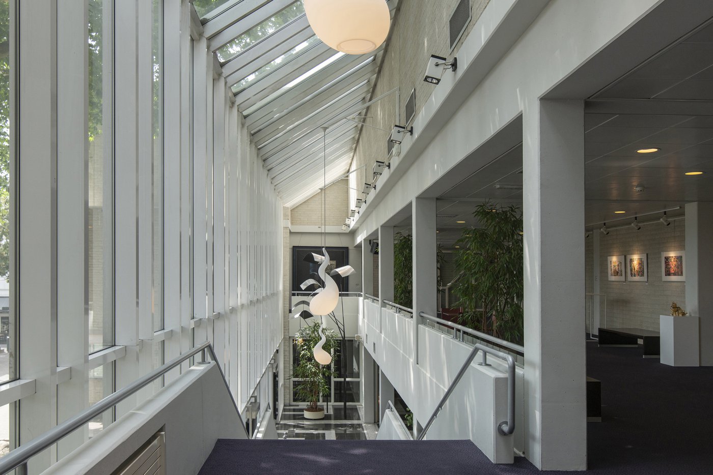
Particular account was taken of possible noise nuisance for residents in opposite houses. The sound remains within the insulated walls because the east façade has remarkably narrow windows.
Innovation with air cushions
An innovation was used in the design of the large hall: the floor with all the seats can be slid into a storage space underneath the stage in a very short time because of air cushions placed underneath it. This creates an empty, flat floor, suitable for pop concerts and other activities.
Space frame under hall ceiling
The advantages of this type of roof construction are:
- it is a relatively inexpensive span
- because of its open character, it adds extra construction height, which is necessary for the desired acoustics
- theatre spots, speakers and microphones can be suspended from any point within the frame
- the lighting and sound technician can move safely around the frame in a trolley, for mounting and maintenance of the spotlights etc.
Design organ as style break
During construction, space had been set aside for an organ to match the rest of the design, but it had been axed due to lack of money. Years after completion, the municipality received an anonymous bequest that was used to purchase a Flentrop organ, a renowned instrument but with a design that did not match the rest of the building. As Boy Wendrich said afterwards, "I can't get used to it. Those curls, those colours: I don't like it. Like a church organ, and we're not in church at all."
Sober design, no frills
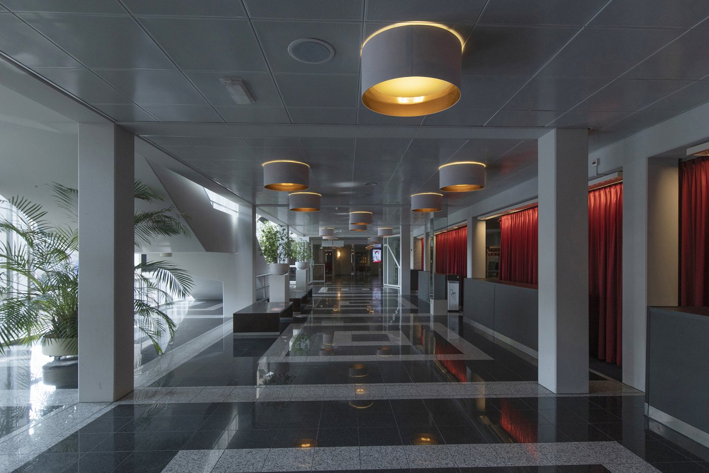
"Austere, spartan" Boy Wendrich himself said of the building. "Few frills, there was no money for that. But at the same time it is impressively decent, with excellent acoustics". And IAA Architecten is still very proud of that.
Staying within budget
In contrast to cultural temples like the Stopera in Amsterdam, the project in Enschede stayed neatly within budget and was built for very little money, namely for an amount that is a fifth of the excess of the construction of the Amsterdam Stopera.
Integral design 'avant la lettre'
The design of the Music Centre was an integral design by IAA (the Engineers and Architects Association): Boy Wendrich made the architectural design, Henk Fokkema the structural design, Jos Kortekaas the technical design and Marijn van Berkel the interior design. And of course IAA took care of the engineering.
